Lesson 4 - Symbology
Table of Contents
Lesson Objectives
- Learn to symbolize data by feature or data type.
Symbology
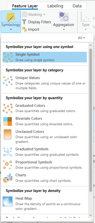
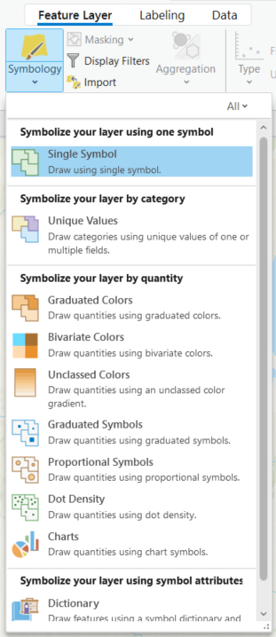
There are several ways to symbolize or visualize data on a map based on feature type, quantitative, or qualitative values.
Point symbols can be visualized using different colours, sizes, or icons.
Polygons or areas can also be filled in with colours to represent numeric, thematic, or categorical data. If using this method to display values, use proportions rather than raw values.
| Point Symbology | Polygon Symbology |
|---|---|
 |  |
When selecting the symbology ensure the symbols are clear and legible to the reader. This includes considerations for colour blindness. The View tab of ArcGIS Pro includes a colour vision simulator for different vision types. The Colour Brewer tool (Cynthia Brewer, Mark Harrow, Pennsylvania State University) also suggests colour ranges based on the number of classes and nature of the data.
Activity
Follow along with the video by repeating the steps in ArcGIS Pro.
View the original video from Esri here
The text version of the tutorial can be found in the Esri Documentation.
Summary
This lesson covered:
- How to symbolize point, line, and polygon features based on values or themes.
Additional Resources (optional)
Below are links to additional resources which go into more detail on map symbology:
- Cartographic creations in ArcGIS Pro - Learn ArcGIS Tutorial Series (Esri)
- Design symbology for a thematic map in ArcGIS Pro (Heather Smith, Esri)
- Improve 3D thematic symbology (Nathan Shephard, Esri)